Monday, 21 February 2011

'BLACK and WHITE'

OTWAY's kitchen
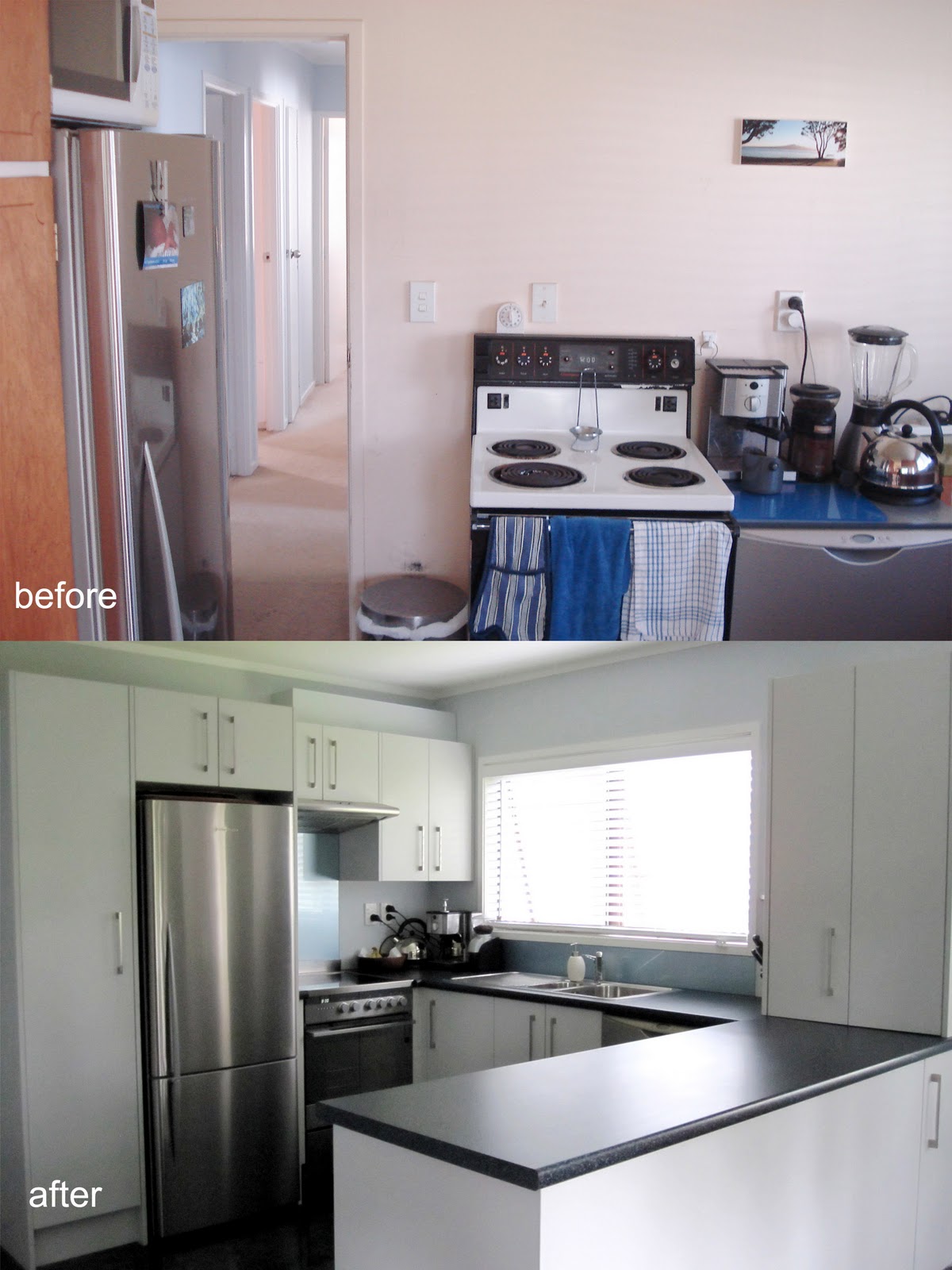
In a home with children, the most invited room is often the kitchen.  The owners of this house, a professional couple with 3 little girls, they required a simple, sleek and easy to clean kitchen.
A streamlined look of tall pantries gives a plenty of food storage as well we a big fridge freezer balanced by the wall oven and microwave tower in the centre, an efficient working triangle was created between the kitchen and living room elements.
 Due to limited space, the cooktop and oven required to stay in where it was to be, the rear bench is for clean up and preparation which is also give a nice view from the garden with a pool.  A return bench space forms a breakfast bar area gives extension open up to dining.
Black and white always the ideal match in the kitchen, wall painted in pure sky blue with abstract textured on tile flooring creates a sense freedom and comfortable like the ‘cloud in the sky ’.
The clients were very pleased with this clean, attractive and practical kitchen that meets all the criteria of a great space management.


‘SIMPLY refined’

FINN's kitchen

‘Everything is where it needs to be’ that is what the client knows what exactly she wanted for her renovation kitchen.


 A kitchen with clean lines and well organised cabinetry locations make the kitchen not only create functionality, also user friendly. 
The client also hoped to have an extra storage for small appliances. As requested, a small pantry was sat on bench with these aspects incorporated, also minimising the view of appliance as well as hidden the range hood behind doors.
‘U’ shape is the style that the client preferred for this limited space, the client wanted to create a fresh and clean look. Frost grey door creates a strong contrast with Terrazo Black benchtop, the stoney textured finished gives a sense of neutral.


 The return benchtop give up with overhang to meet the dining table by the window, and the back cupboard gives extra storage. Let more light in and opened through to the dining.


'WELL connected'

NOLDUS's kitchen

The owners of this house were clear about their desires for their renovation. 

This small, dated kitchen required a complete renovation to update it to a modern, working friendly design. The existing kitchen, at the entrance to the staircase, required people to walk pass to the living and dining room, it becomes well connected and open the room up to family, dining and office after remove the blocking wall in between.

As the space was limited, the owner wanted to have more storage for her serve ware collections as well as a bench space, therefore a rear bench runs out to meet the office table and living room, acting as a servery to the room, a set of shelf opens at the back of the cabinet dramatically change for the working area.

The sink supposed to be located by the window, but due to client request of swapping the cooktop and sink area to meet her habit in the life. 

The gourmets, salt and pepper mills are displayed in the tall open shelf next to the fridge create a sense of art exhibition.


'ALL WHITE'

BROWN''s kitchen

A new home for a working young couple with 2 lovely girls, a practicle new 'U' shape kitchen with hardwearing, easy clean surfaces was a must. The client loved the strong minimalist look and wanted to be able to look out to a nice backyard while working at the sink.

The cabinetry, bench tops and colours were matched to the style and colours of the existing joinery, timber exterior and stunning outlook. This created a neutral colour palette with a variety of textures including stone, glass, laminate and aluminium, especially those 'funky' handles, such making it a feature.

The rangehood and fridge are standing free, only the white dishwasher is subtle emerge in the white cabinetries, which given uniformity to achieve an overall streamlined look.


'PROPOSED NEW DWELLING'

Cardboard model  for MOX interior architecture Ltd

'FANSWORTH HOUSE' model

In this Elective project we are aiming to make an ARCHITECTURE MODEL for Farnsworth House designed by Miles Van Der Rohe with 1:100 scales.

We are encourages to view 2D drawings and images to comprehend the structure also details of this famous building, then use material Styrene to present an aesthetic appeal model making.

This is going to develop and reflects an in depth understanding and MODELING skills.


'Genius Loci'

'Genius Loci' is to show an understanding of the ideas of examination and collection of information explore throughout the course of the module.

According to this COLLECTION module, shopping bags are the most that had been collected each time after shopping.

A display creates in spiral form to explore a TIME of shopping MEMORY, the colour and the sizes of the bags creates impact of MOVEMENT it also gives an aesthetic appearance to tell the shopping stories that form the PAST and RECENT.